Make a Manhattan plot from a VCF file
Published:
A friend recently asked me to make her a Manhattan plot from a VCF (Variant Call Format) for some Plasmodium berghei SNPs. I was familiar with neither Manhattan plots nor VCFs, but we ended up with a decent-looking plot. This is far from the most sophisticated solution, but this post might help the SNP-naive (like me) looking for a simple way to go from VCF to Manhattan.
To start, you will need a VCF file and genome FASTA. For this blog post I’ve used a sample VCF from 1000genomes for human chromosome 151 and the GRCh38 human reference fasta2. Unzip the VCF file.
Install the tidy_vcf Python program (https://github.com/silastittes/tidy_vcf)) with pip install tidy-vcf. cd into the directory your VCF is in, then run
tidy_vcf -v ALL.chr15.phase1_release_v3.20101123.snps_indels_svs.genotypes.vcf -o vcf.tab -g geno.tab
The rest of the analysis will be in R. Load the below libraries (if needed, first install them with BiocManager::install()).
library(tidyverse)
library(GenomicFeatures)
library(Biostrings)
library(ggbio)
Read in the geno.tab file generated by tidy_vcf. For this demo, I’ve randomly sampled some SNPs to plot so this will run quickly.
geno <- read_delim("geno.tab", delim = "\t", na = c("NA", "./.", '.'), comment = "#")
geno <- sample_n(geno, 20000)
You should end up with:
> geno
# A tibble: 20,000 x 11
   IND     CHROM      POS ID          REF   ALT    QUAL FILTER GT       DS GL
   <chr>   <dbl>    <dbl> <chr>       <chr> <lgl> <dbl> <chr>  <chr> <dbl> <chr>
 1 NA19435    15 22383383 rs77473792  G     NA      100 PASS   0|0    0.2  -0.48,-0.48,-0.48
 2 NA07357    15 22382858 rs149845348 C     NA      100 PASS   0|0    0    0.00,-5.00,-5.00
 3 HG00638    15 21158140 rs1460901   A     NA      100 PASS   0|0    0    -0.00,-2.17,-5.00
 4 NA19985    15 20088588 rs187929970 G     NA      100 PASS   0|0    0    -0.00,-4.40,-5.00
 5 NA12889    15 20409194 rs184466637 G     NA      100 PASS   0|0    0.35 -0.22,-0.42,-1.67
 6 HG00740    15 20131956 rs191471933 A     NA      100 PASS   0|0    0    -0.03,-1.23,-5.00
 7 NA19648    15 20243691 rs77931769  T     NA      100 PASS   1|0    1.15 -1.63,-0.39,-0.25
 8 HG01259    15 22300290 rs2605990   G     NA      100 PASS   0|0    0    -0.00,-3.02,-5.00
 9 HG00096    15 20049215 rs181417495 C     TRUE    100 PASS   0|0    0    -0.01,-1.79,-5.00
10 NA19390    15 22385519 rs186719629 T     NA      100 PASS   0|0    0    -0.00,-2.34,-5.00
# … with 19,990 more rows
Here is the ugly part. The genotype likelihoods i.e., “GL” column, is defined in this document as:
genotype likelihoods comprised of comma separated floating point log10-scaled likelihoods for all possible genotypes given the set of alleles defined in the REF and ALT fields. In presence of the GT field the same ploidy is expected and the canonical order is used; without GT field, diploidy is assumed. If A is the allele in REF and B,C,… are the alleles as ordered in ALT, the ordering of genotypes for the likelihoods is given by: F(j/k) = (k*(k+1)/2)+j. In other words, for biallelic sites the ordering is: AA,AB,BB; for triallelic sites the ordering is: AA,AB,BB,AC,BC,CC, etc. For example: GT:GL 0/1:-323.03,-99.29,-802.53 (Floats).
So, I separated each of the comma-separated GL values into their own columns. For the purpose of this demo, I’ve plotted the GL values in position 3 (that is “BB” from the GL ordered as AA,AB,BB). Adjust which value/s you plot based on what is meaningful for your data.
gl_geno <- geno %>%
  mutate(GL = unlist(geno$GL)) %>%
  separate(GL, into = paste0("GL", 1:3), sep = ",") %>%
  mutate(across(11:13, as.numeric)) %>%
  dplyr::select(1:3, 11:13) %>%
  pivot_longer(cols = 4:6, names_to = "GL.position",
               values_to = "GL") %>%
  filter(GL.position == "GL3")
gl_geno will look like:
> gl_geno
# A tibble: 20,000 x 5
   IND     CHROM      POS GL.position    GL
   <chr>   <dbl>    <dbl> <chr>       <dbl>
 1 NA19435    15 22383383 GL3         -0.48
 2 NA07357    15 22382858 GL3         -5
 3 HG00638    15 21158140 GL3         -5
 4 NA19985    15 20088588 GL3         -5
 5 NA12889    15 20409194 GL3         -1.67
 6 HG00740    15 20131956 GL3         -5
 7 NA19648    15 20243691 GL3         -0.25
 8 HG01259    15 22300290 GL3         -5
 9 HG00096    15 20049215 GL3         -5
10 NA19390    15 22385519 GL3         -5
# … with 19,990 more rows
We want to be able to plot the GL values at their chromosome position. We will need to get the “widths” (chromosome lengths) and chromosome names to create a Seqinfo object, that will then be used to create a GRanges object that will allow plotting using the ggbio package. More info about GRanges can be found at the GenomicRanges Bioconductor page. Although this demo just has data from chromosome 15, normally you will want your Manhattan to include the whole genome.
Read in the genome FASTA file with the Biostrings function readDNAStringSet. Ideally the FASTA will have the same chromosome names as your VCF (e.g. both have “chr15”). This was not the case for the FASTA I use in this demo, in which chromosome 15 was simply named 15. If you get errors in the next step check that your chromosomes are named the same, and manually set the names if needed.
genomestrings <- readDNAStringSet("hg38.fa")
chr15 <- genomestrings["chr15"]
chr_lengths <- width(chr15)
seqnames <- "15"
seqinfo <- Seqinfo(seqnames = seqnames, seqlengths = chr_lengths)
Now create the GRanges for your SNPs.
gr_geno <- makeGRangesFromDataFrame(gl_geno, keep.extra.columns = TRUE,
                                    ignore.strand = TRUE, seqinfo = seqinfo,
                                    seqnames.field = "CHROM", start.field = "POS",
                                    end.field = "POS")
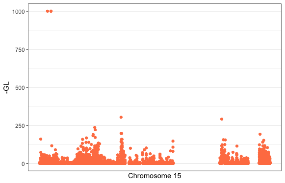
Finally, use the ggbio package plotGrandLinear() function to plot your SNPs GL value at their genomic position. You can customise the plot by adding ggplot2 themes, colour scales etc. The plotGrandLinear() function takes a bunch of in-built arguments for adding cut-off lines, highlighting points, specifying axis limits etc.
plotGrandLinear(gr_geno, aes(y = -GL),
                xlab = "Chromosome 15",
                color = "coral") +
  theme_bw() +
  theme(legend.position = "none")